One of my favourite takeaways from architecture school has been the concept of drawing to specified scales.
In 3D design software, it’s common practice to create models using 1:1 full sized units. Since you can zoom in as much as you like, it’s impossible to run out of space.
I’ll never forget how confused I was in first year when we were asked to submit our studio projects with drawings at scales like 1:20, 1:50, and 1:200. If I created the drawing digitally, and the submission was digital, what on earth did a 1:50 scale even mean? The scale changes the moment you adjust the window size… Doesn’t it?
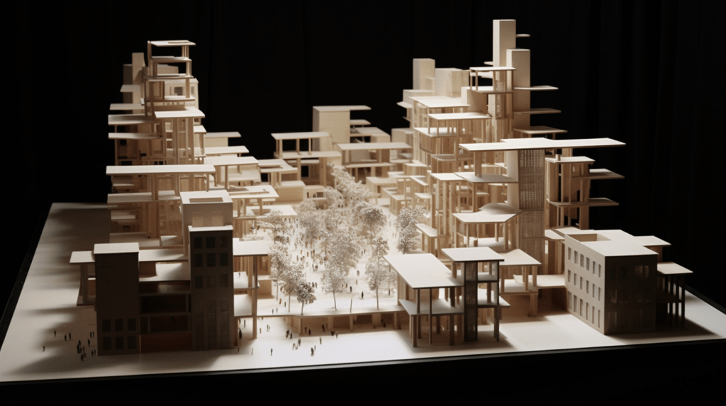
As I later learned, drawing at a specified scale isn’t merely about measurable size. Scale is also an indicator of the required level of detail.
A 1:20 drawing might show features as small as a toilet paper holder, while deliberately cropping out the broader context. A 1:200 drawing might omit the furniture entirely, but reveal the building’s relationship with the landscape.
Including more information in a drawing like this would be both a poor use of time, and a distraction from the aspects of the work the drawing was made to highlight.
If we wish to work efficiently and keep conversations focused on the right things, it’s important to make thoughtful decisions about the scales that align best with the ideas we’re trying to communicate. Not all designers share their thinking through drawings, but the principle applies to any medium.
