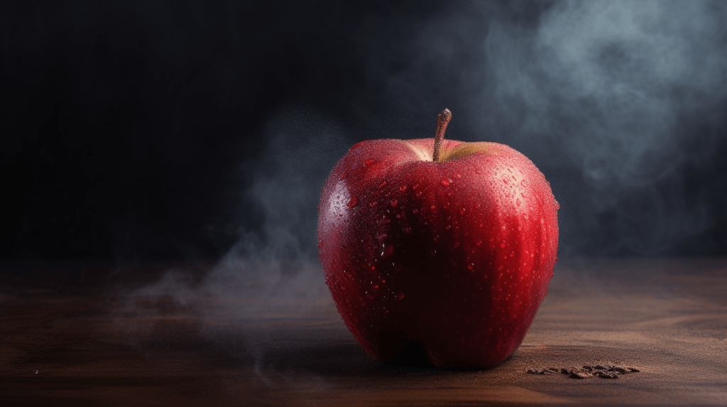
The Red Delicious apple, while aesthetically pleasing, has become a classic example of the trade-off between beauty and quality due to years of selective breeding for appearance.
This post isn’t about apples, but about a trend I’ve observed in the architecture school I attend, which seems to follow a similar path: the overemphasis on presentation to the detriment of fundamental substance.
I’m concerned that this focus is negatively impacting graduates’ abilities. And considering it’s unlikely that this phenomenon is unique to my institution, it’s perhaps time to initiate a conversation on potential solutions.
This isn’t a critique of design favouring form over function – that’s a topic for another day – but rather a commentary on the inclination among students to overemphasize the aesthetics of their presentation materials instead of their actual designs.
It’s astounding how many design students, including some I personally know, spend nearly half their project development time perfecting presentation board layouts and vector-based representation. They invest countless hours refining colour palettes, inserting whimsical elements like kids with balloons, or sticking clothes on a laundry-line in just such a way that they appear to be flapping in the wind. Yes, this particular example is surprisingly common.
While visual showmanship is indeed a crucial skill, it shouldn’t overshadow the primary objective of design students – learning how to be darn good designers. Graphic artists, or more likely AI programs, will handle the rest on any large-scale professional project in the future.
Good design is incredibly challenging to produce, and it should be stressed that honing this skill is where students should direct most of their energy. Society needs this.
So why are students adopting this behaviour? I believe it’s largely because design review panellists (who students usually take quite seriously) tend to comment first and most frequently on visual elements. This may be because critiquing graphic presentation requires less mental energy than actively listening and engaging in deep analysis of a student’s project. I don’t fault the reviewers who generously donate their time to help students improve; reviewing is a challenging task. But it’s important to remember that comments from authority figures carry significant weight for students, leading to an implicit understanding of expectations and what truly matters. Unfortunately, this can often unintentionally signal the wrong priorities. Coupled with the competitive atmosphere of design schools, a status and validation driven cycle can emerge that promotes an excessive focus on surface-level aesthetics.
How can we ensure that the primary skillset of future graduates is the actual creation of excellent designs?
Firstly, it’s important for critics of student work to be aware of the impact their feedback has, and to stress the intrinsic value and practical execution of the student’s concept. We also need to discourage, or even prohibit, drawings that allow students to conceal underdeveloped work behind graphic embellishments. This doesn’t equate to promoting unattractiveness – we certainly don’t want any “bruised apples” – but we need to ensure that drawings and presentations truthfully represent the conceptual integrity of the design.
This means clarifying which forms of representation (drawings, videos, etc.) serve what purpose, and ensuring these boundaries aren’t blurred. Here’s a suggested list for architectural design projects, which can be modified for other contexts:
- Icons: What is the project’s main theme?
- Diagrams: How does the project function or perform?
- Plans/ Sections/ Elevations/ Isometrics: What are the spatial dynamics?
- Renderings: What are the aesthetic and emotional aspects of different areas?
Drawings that tend to obscure the truth, barring special circumstances, include:
- “Post digital” or non-photorealistic renderings.
- Intricate vector drawings with colours, textures, or objects that do not directly address one of the four questions above.
- Any depiction that portrays something in a way that the designer knows could never feasibly be realized in the actual built environment. Note, I have nothing against presenting things honestly in the best possible light.
By implementing these changes, I believe we will set ourselves on a path toward producing graduates that can deliver designs as appealing and substantial as a Honey Crisp of the finest quality.
