Relative to its power and capability, the original iPad was probably one of the most intuitive pieces of technology ever designed.
People who had never been comfortable with computers learned to use it with remarkable ease.
Part of the reason it was so successful was that the software made extensive use of a technique called skeuomorphism. It’s an ironically intimidating word given what it means: technology that makes itself friendly and easy to understand by mimicking the interface of the tool it’s been designed to replace.
The original iPad calendar app was a great example. It looked and worked just like its paper counterpart. In the early days it even had leather binding and glossy pages that would reflect the sunlight as you flipped from one week to the next.
Eventually all of this visual flourish went away. The reason? We didn’t need it in order to feel comfortable anymore. And for a lot of young people, the original reference was starting to lose its relevance. Most people of my generation have never used a physical calendar in their lives.
What’s emerged from the ashes of all that digital paper is a pared-back interface that with each generation of software gets a little closer to what we might have come up with if we designed a calendar tool from scratch for the internet-connected, AI infused, multi-touch display covered supercomputer on which the app actually runs.
At time of writing Apple hasn’t revealed what the calendar app will look like on its new Vision Pro, but I suspect for at least the first few years it’s going to look an awful lot like the app we’ve all become so familiar with on iOS.
So what’s the lesson?
As designers it’s tempting to let form follow function and build new things that are a true expression of the technologies that enable them. Certainly that feels like a pure and elegant way of working. The thing is, there’s a certain amount of cultural lag time that must be taken into consideration.
If we want the tools, experiences, or other innovations we create to be understood, loved, and widely adopted, we’re often better off starting by making references to things that people already know and accept.
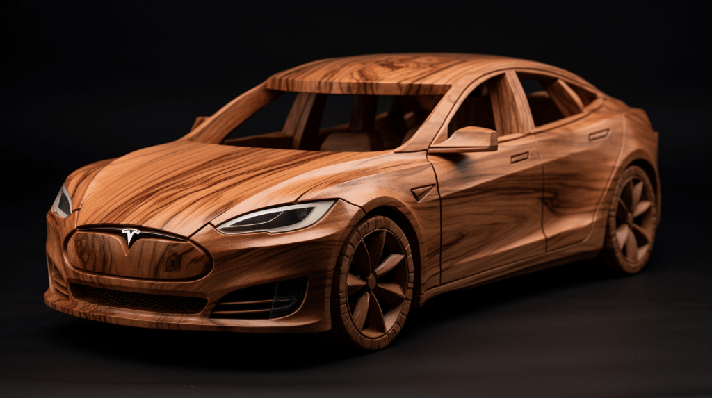
The application of this idea goes way beyond software by the way. The first Tesla cars didn’t need grilles, but they needed to look like people’s idea of a car… And so they got grilles. The first steel skyscrapers often used structurally unnecessary arches, pediments, and colonnades that appeared to be made of brick and stone. Had we skipped straight to modernism, this new generation of buildings would have had a much harder time gaining traction with a skeptical public.
When it comes to your work, is it likely that people will already understand what you’re making, or could they benefit from an analogy?
Ps. Something to avoid is creating misleading skeuomorphs. For ages (and possibly still?) the Garage Band app featured a circular dial that you could only interact with by dragging up and down on the surrounding area of the screen. I figured it out eventually, but the process was frustrating.
One further aside… It’s also worth noting that some patterns are so ingrained into our culture that their relevance will endure even when their connection to previous technology crumbles. Computers haven’t used floppy disks in 20 years, but thanks to Microsoft’s persistence, the floppy symbol has become synonymous with saving a file. Teens today don’t know what that button is supposed to be, but they know what it means. Symbolically it’s just as clear as a square button on a video interface or a green light at an intersection.
