In an era of advanced visualization tools, it’s easy to create startlingly clear renderings of proposed projects. The danger to designers and their clients is that the realism these tools offer belies the complexity and challenges imposed by the real world.
If the things we design don’t take reality into account, they’re unlikely to survive the journey from imagination into concrete form without some serious scars.
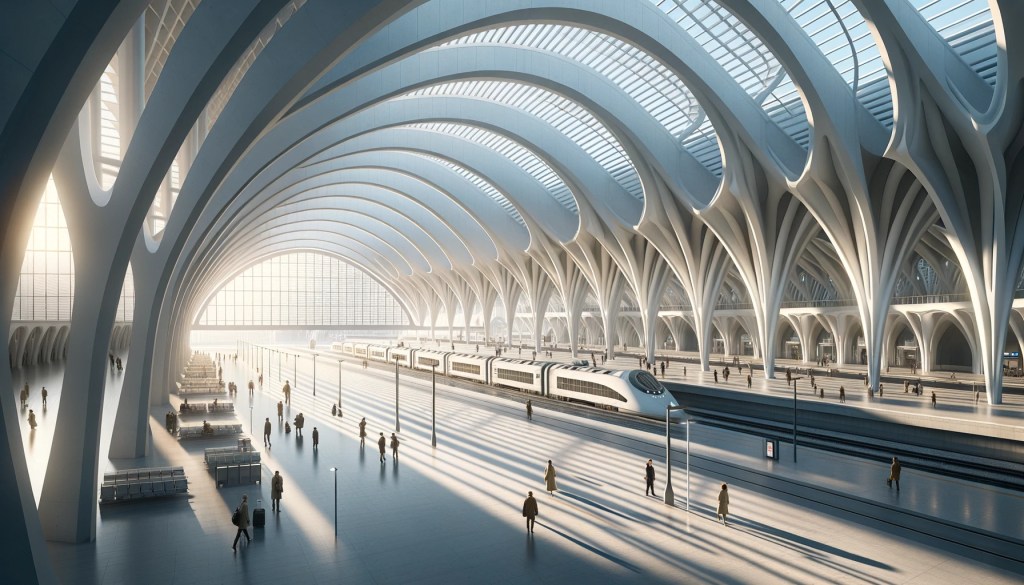
In the architecture world, this sort of problem happens all the time, but perhaps no architect seems to face this issue more frequently or with more egregious consequences than Santiago Calatrava. His studio is famous for sculptural concepts that push the envelope, but they’re also known for an inability to acknowledge the world in which their work must exist. They get sued a lot.
Calatrava’s Zubizuri pedestrian bridge in Bilbao was designed with a beautiful glass-brick walking deck. Too bad it rains in Bilbao. The most recent photos of the project I’ve seen show that glass deck covered in wrinkly black anti-slip mats.
Calatrava’s transit hub at the World Trade Centre in New York, like most of his work, is painted white from top to bottom. Yes, it’s white… In New York… And it’s a train station. Who could have predicted it might not age well? And the orange peel texture of the fire-resistant paint almost guarantees it’ll never look clean again.
Wishful thinking is a powerful tool. It can bend the judgement of designers and clients, but alas, it cannot bend reality.
The better path is completely embracing the world as it is. If the white paint is going to get dirty, render it honestly, and make a decision about whether that’s something we can live with. If the answer’s no, it’s time to go back to the drawing board… Either to change the design, or to develop a layer of the design that makes this gleaming vision feasible and maintainable.
As usual, I can’t talk about good design without coming back to Disney. Their properties are immaculate. They generally look and work just as great on day 5000 as they do on day one. There are never random add-ons. Nothing is left to chance.
They pull it off because they must. Unlike most works of architecture where the designer can get away with press photos taken immediately after opening, the team that designs their facilities is on the hook for the long haul. There’s nowhere to hide when your reputation is staked on perfection and you have new guests showing up every day, decade after decade.
The way they solve problems is complex, but it all comes back to a simple resolve to think things all the way through. If guests generate a lot of garbage, better build in a system that accounts for that…Overflowing trash bins make Main Street look a lot less charming. If buildings will need to be repaired, better design a scaffolding system that’s minimally obtrusive. Perhaps stick a photo of the facade in front of the building so that most people will barely notice it’s covered up.
Apparently at Disney’s Galaxy’s Edge, there’s even a provision for instantly replacing a failure-prone critical animatronic with a projected substitute (min 15:30) in order to avoid ride closures or a damaged show. It’s integrated in a way that seamlessly fits into a modified version of the ride story. If you didn’t know it wasn’t supposed to work that way, you’d never guess.
Not everyone has the budget for something that elaborate, but I think this is the standard of thinking we should all aspire towards.
The designer’s job is not to draw something great but to make something great happen. Our responsibility is to do the hard work of sorting through the messy details that the real world entails, and to be realistic about the way the thing we’re proposing will engage with each of those challenges. Maybe that means setting aside part of the budget for regular cleaning, maybe that means painting it grey. In any case, the designer must make a thoughtful choice.
